LETTERS, LETTERS EVERYWHERE...
BS"D
I met with Secret Sofer today (the not-Rabbi-Laimon-sofer who taught & certified me) for a crit of my recent work. Because I can always learn more & I can always do better. This serves to keep me humble(r). Besides, other soferim find nothing to criticize in his work. I'm so lucky to have him as my teacher.
It makes such a huge difference to my work when we can bend over it together. I wish we lived in the same city. Heck, even the same hemisphere would be a start...
He began with my Qufs (ק): the rosh, head, of the descending tail is waaay to close to the lower horizontal. It's still technically kosher, but this will cause the reader to stop & check for a negi'ah, letters touching (which is not allowed). It's just bad calligraphy. It must not be distracting. Also, I have to think "circle" when I'm making that initial stroke. Round. Like Reysh (ר).
We moved to Ayin (ע). I have a "Sefardi" (Iberian/North African style) angle/curve/heel on the upstroke of the tail. The Ashkenazi Ayin's tail is straighter. Also, the left head must be turned to 90˚ as he commanded me 3 years ago, so that it resembles the upper Yud (י) of the letter Alef (א).
Went on to Mem (מ). I make a Sefardi-type curved bridge where the Ashkenazi is supposed to be straight across. & the body is a tad wide on my Mems as well - they should be two-thirds of a Khaf (כ), except that the bottom right hand corner needs a sharp, square shape.
Now Shin (ש). I have to make the inner corner more pronounced & smooth, a gradual, sexy curve from the base to the "wrist" of the far right Vav. 45˚ angle of the middle arm into this corner is also a must.
Then Chet (ח). The join between the roshei, heads, & their respective legs must be stronger & in more proportion, ie the difference between the thickness of the join & the middle of those down-stokes should be less exaggerated.
& finally, Hey (ה). Make a "6" for the Yud-part. 'nuff said.
I noted that he had nothing bad to say about any of my other letters...thank G@d :)
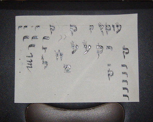
Here's a piece of scrap parchment we worked on together (sorry about the silver highlights - that's just the black ink being all shiny under the flash). I did some of my letters with a bamboo kulmus I carved & others with a quill, while all of his are with a quill:
I am committed to ongoing guidance from my mentor, as I aspire to continue growing my craft & refining my skills.
Technorati tags: religion, religion and philosophy, Judaism, Jew, Jews, Jewish, Torah, Canada, Canadian, journal, weblog, blog, diary, soferet, sofrut, safrut, scribe, art, thoughts, stam, feminism, ritual, women, woman, life, sofer, Israel, Jerusalem, calligraphy, Middle East, sexy, Technorati.


1 Comments:
This is so cool to see! I love hearing you talk about your work, what you do and how you do it and where you hope to improve. Your commitment to the derekh is inspiring to me.
Post a Comment
<< Home